ITOGO
Online store with electronics, household and computer equipment
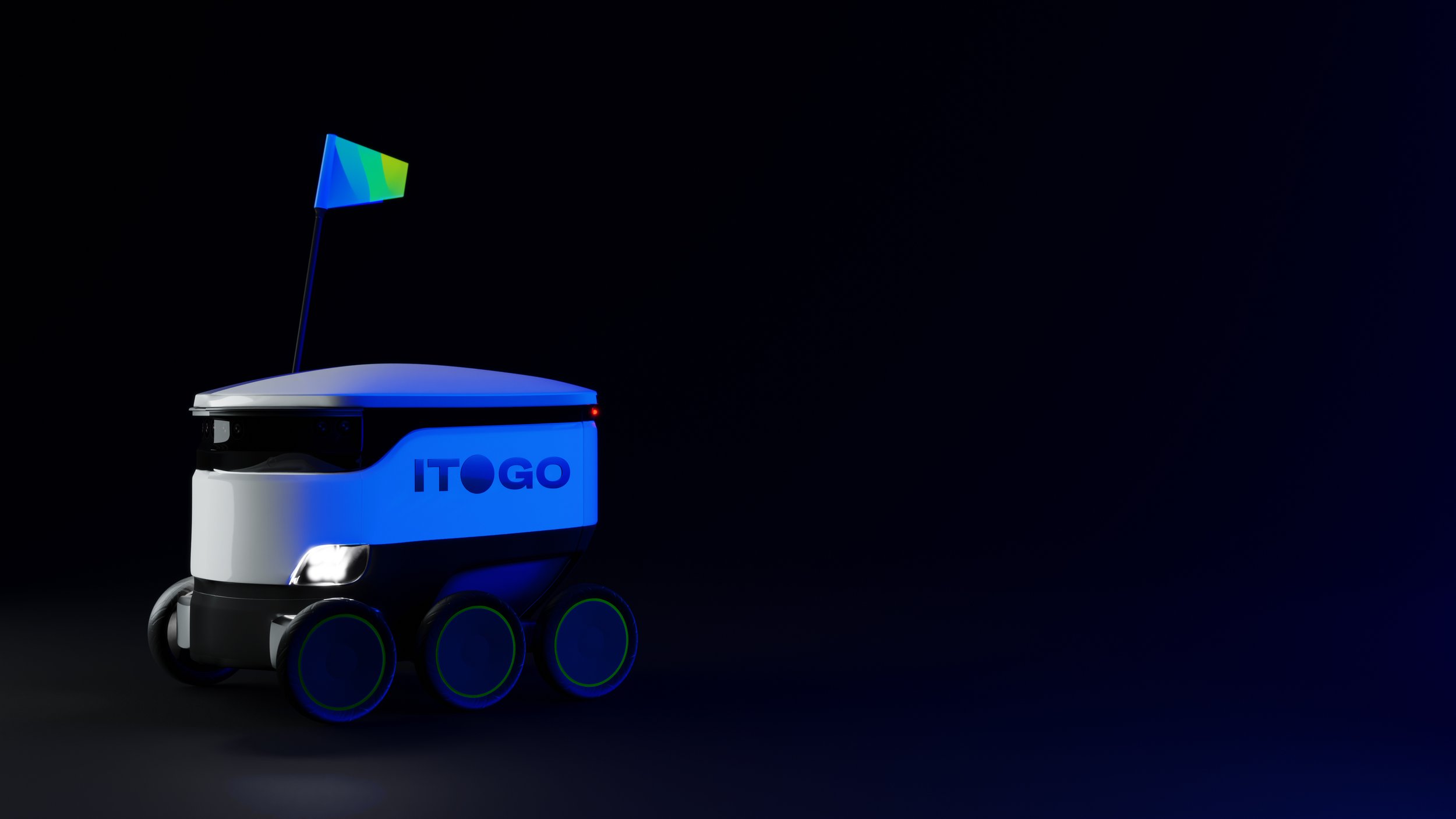
ITOGO means total in Russian. The graphic element in the logo in the form of a dot with a gradient symbolizes the ability for users to quickly and easily “put an end” to the issue of staffing the workplace at home and in the office of technology. The identity illustrates the customer's path to the “result”, for which both the result and interaction with the company are important.


Design, art-direction, case production
Made with LINII Group team